Communication | APS Assheuer + Pott
Sense and sensibility
The right amount of words and pictures – the FRAMES brochure describes APS’s buffet system in a simple yet emotive way
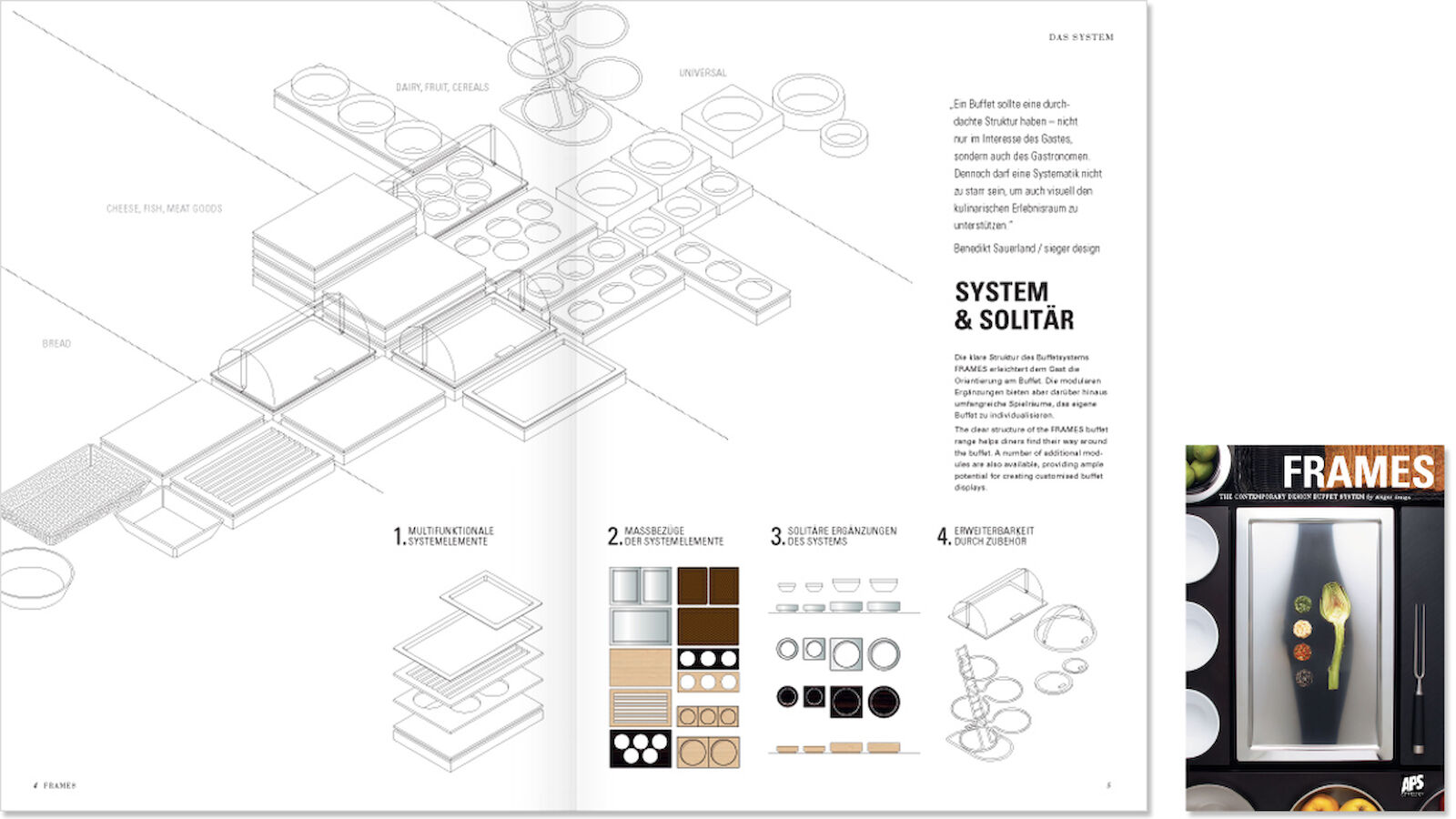
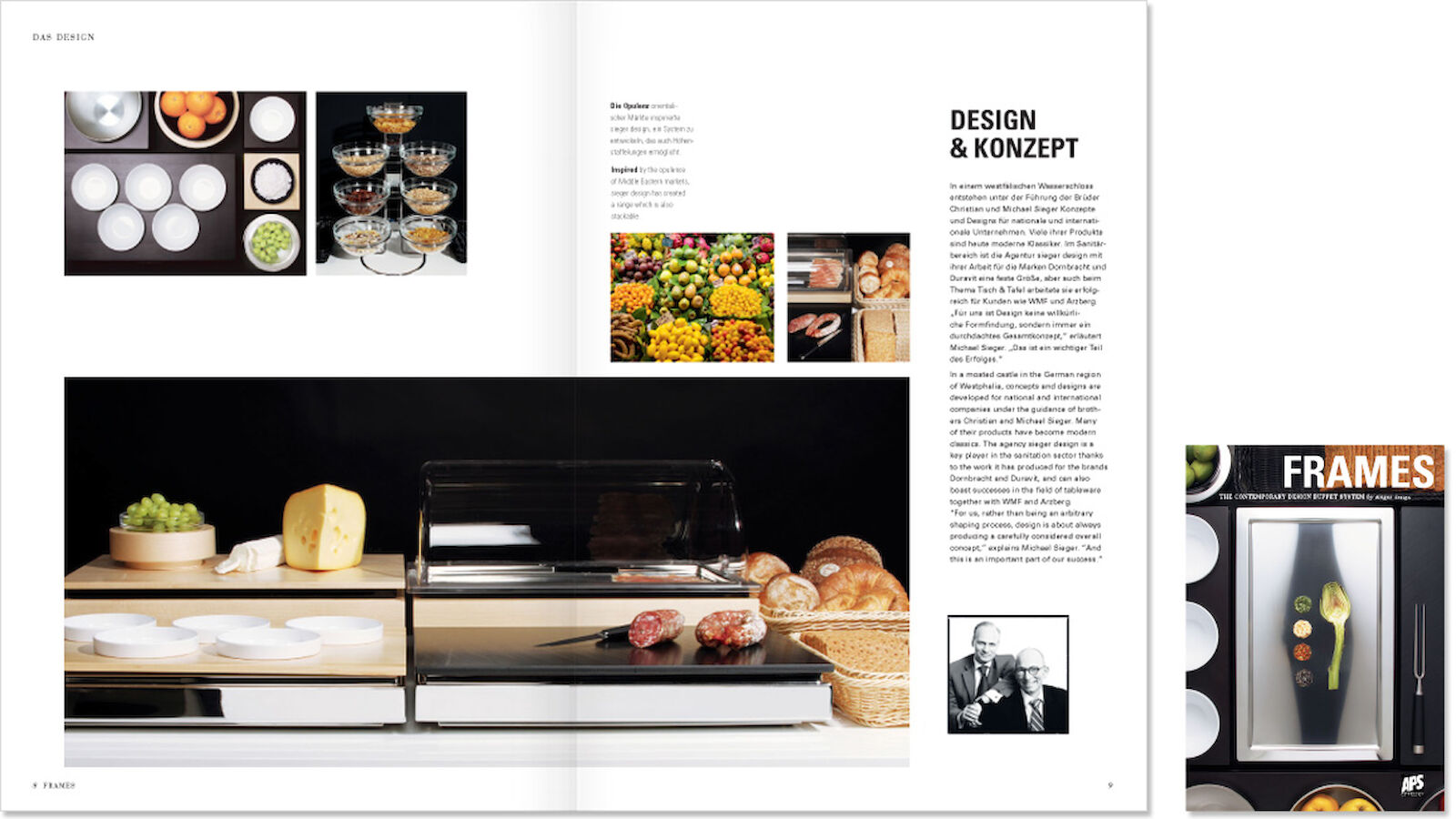
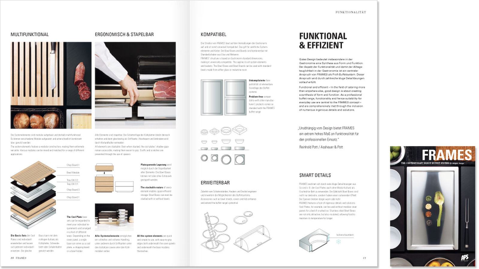
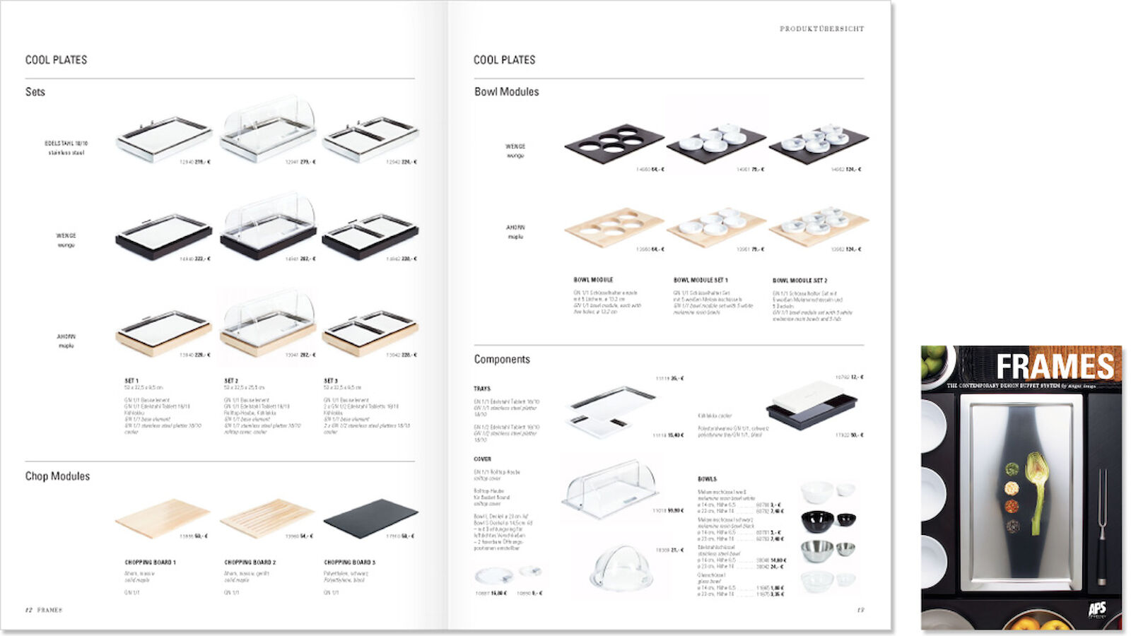
The clear modular construction and classically minimalist design principles of the FRAMES range also served as the basis for its product brochure. The detailed photo spreads are both informative and subtly emotive, working in harmony with simplified technical drawings to engagingly explain even the most complex features of the buffet range, which was officially unveiled by Assheuer + Pott (APS) in 2011.
The more clearly structured a design, the easier it is to understand and use. Given their target audience of specialist retailers and catering professionals, the FRAMES communication materials needed to be focused squarely on sales. However, the range’s ingenious multifunctionality and aspiration to superior design also rendered it emotive, meaning that the product brochure needed to accomplish a difficult balancing act and appeal not only to the head but the heart as well. It was therefore essential to create a characteristic visual style which, like the design of the product itself, brought together the seemingly irreconcilable – the sensible and the sensuous – and thus truly set itself apart from the impersonal character so typical of large-scale commercial catering.
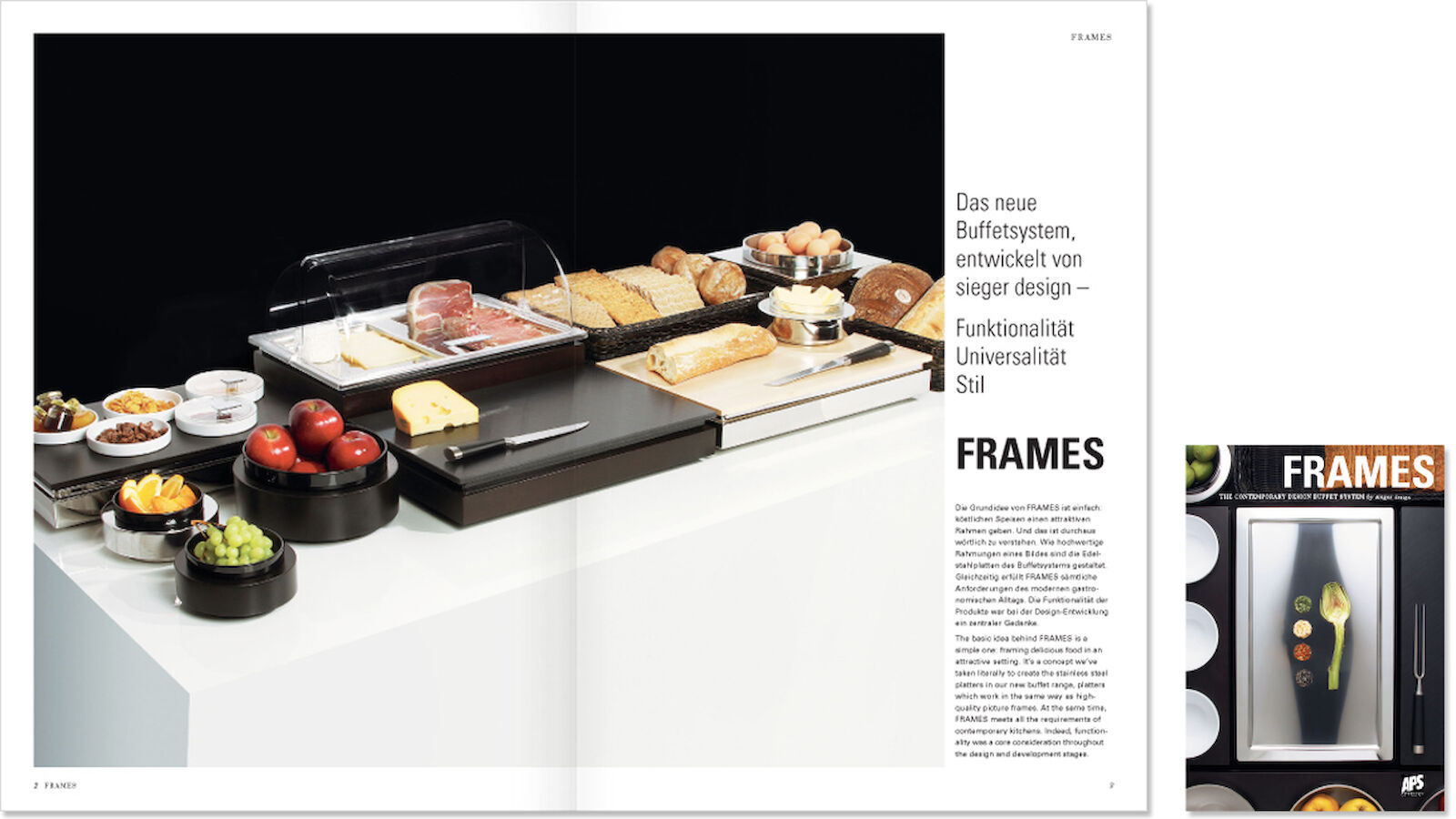
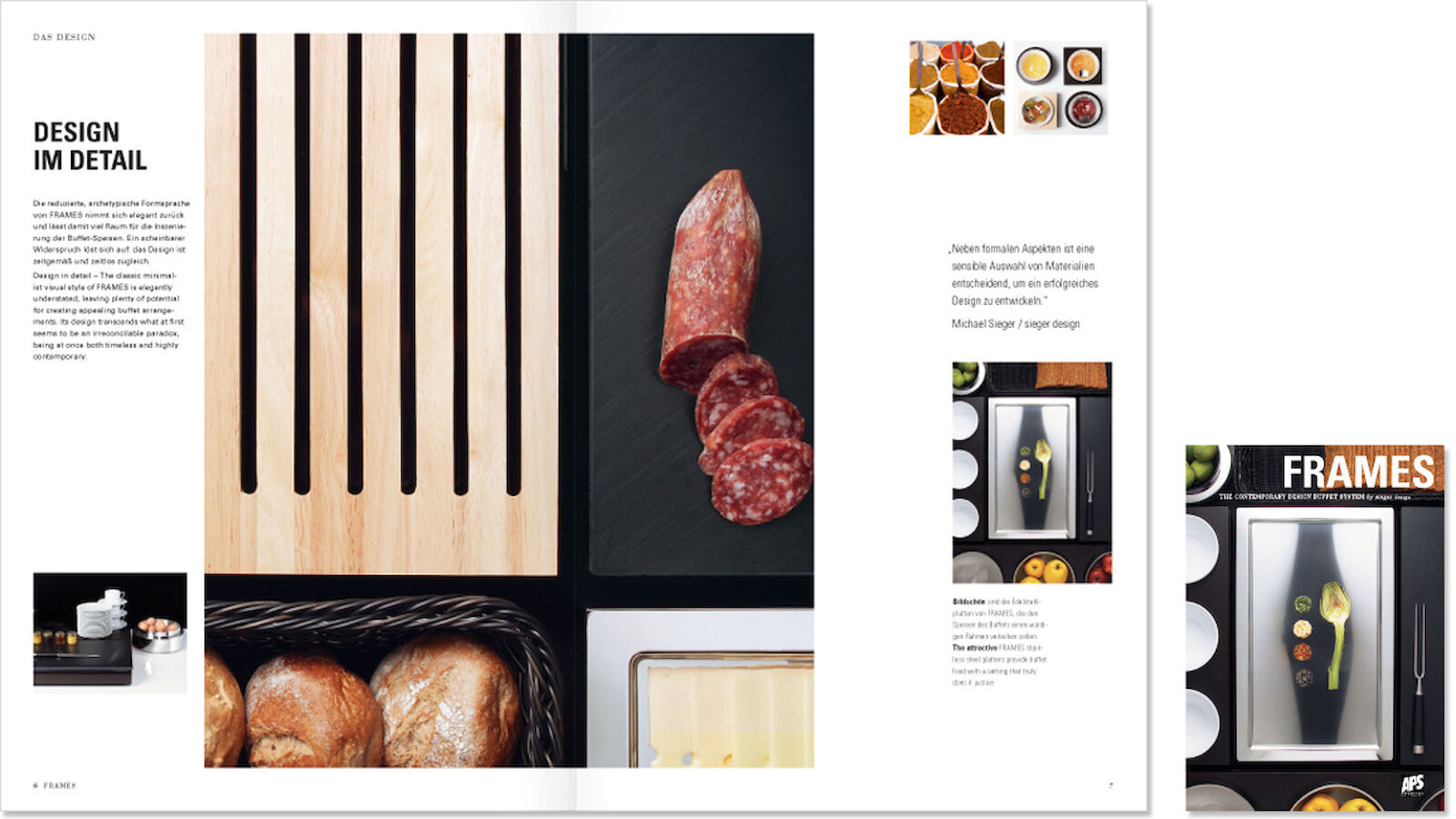
The complex functionality of FRAMES is explained in just a few simple words. Thus the brochure contains short and highly relevant product descriptions accompanied by expressive photography. At the same time, lavish photo spreads underscore the clear contours and alluring contrasts of the colours and materials used. The pictures serve above all to illustrate the range’s unique tactile qualities, an aim which led to the use of minimalist visual compositions combining stainless steel, wood and wickerwork. Food and various props are shown, but are depicted cropped and in an understated fashion. They thus remain mere metaphors, allowing viewers of the images the freedom to exercise their own imaginations. The design’s core concept is potently manifested on the cover, where an minimalist arrangement of foods set on a stainless steel mount is depicted from above in a manner reminiscent of a painting. It’s an image which also serves to explain the uniquely sophisticated buffet range’s name. This product photography proved so popular with the client that the brochure ended up comprising a significantly greater number of pages than originally planned in order to allow the inclusion of more images. Some components of the layout even made their way into the design of the stand at the Maison et Objet trade fair in Paris.
The brochure’s clear layout is based on geometric shapes and thus follows the design of the buffet range itself. Technical drawings reminiscent of the field of architecture further contribute to the overall visual impression, illustrating the products’ functionality and providing a stark contrast to the lavish emotiveness of the photography. Clear, utilitarian sans serif lettering stands in opposition to emotive serif typefaces, thus further underscoring the all-pervasive balance between functionality and emotiveness. The brochure was printed on uncoated paper, the slightly coarse texture of which deliberately set it apart from the high-gloss product brochures so commonly used.
- Request project information
- Share project
- Add project to favouritesRemove project from favourites
Would you like to find out more?
Get in touch with us:
