Design | Duravit
The original with a new lightness
With Happy D.2, sieger design is refining an established bestseller from Duravit
In many ways, the journey to Happy D.2 was about staying true to the range’s roots and developing new strengths. It has been completely revamped for 2013, and 14 years since the launch of its predecessor, represents a further milestone in the collaboration between Duravit and sieger design. Combining familiar characteristics with a modern ornate look, the comprehensive bathroom series is asserting its own personality.
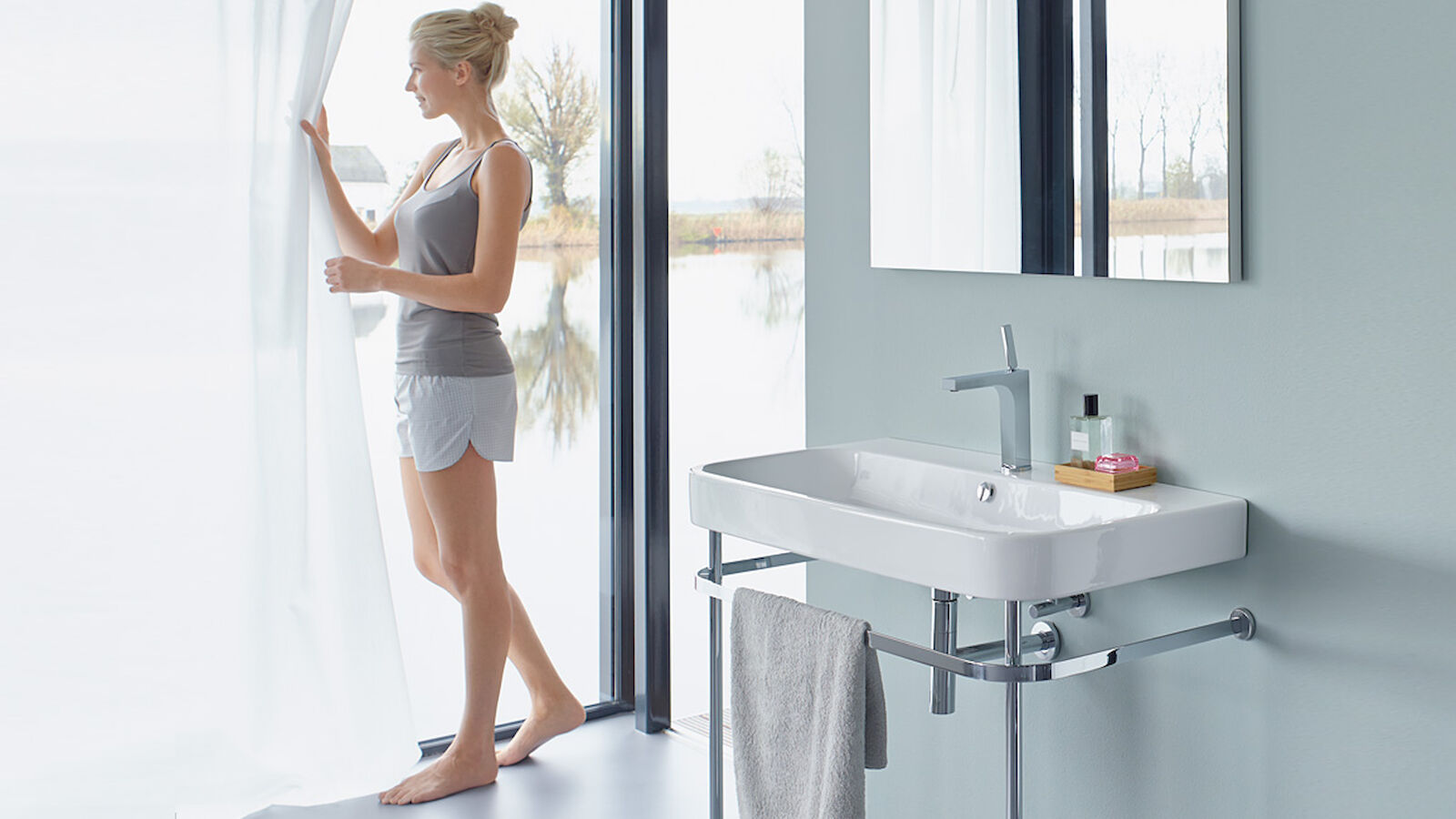
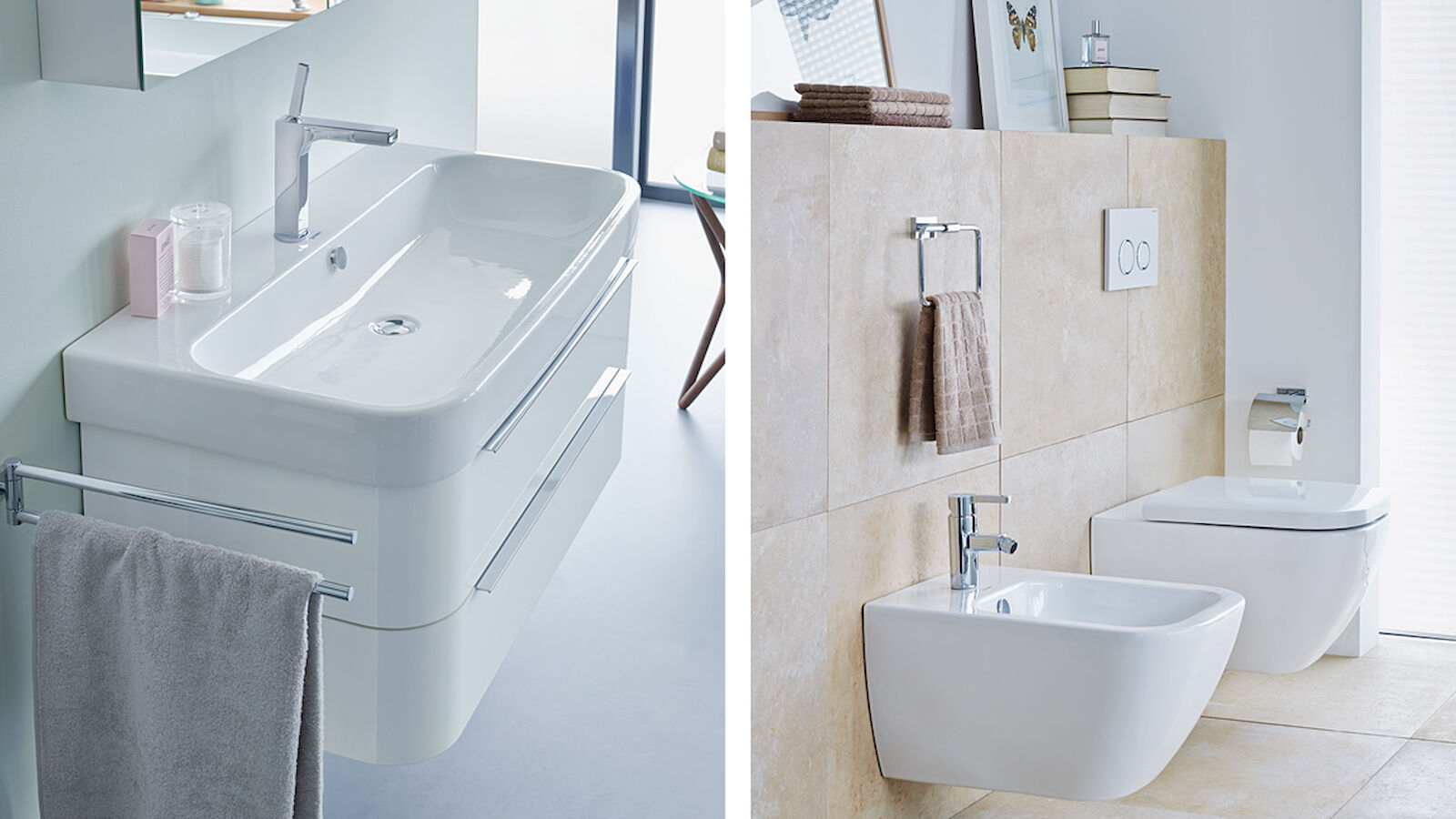
Architectural forms and practical functionality were influential in making Happy D., launched in 1999, a bestseller in the mid market. Its successor of 2013 retains the conciseness and clarity of the original and – thanks in particular to the pure, minimalist design – incorporates another attribute: lightness. This is the guiding principle behind the design and the hallmark of the entire range, which encompasses washstands, bath tubs and other furnishings. Initially planned as a relaunch, sieger design developed a far more independent series than originally planned in light of market-oriented adjustments. Happy D.2 is characterised by striking radii, symmetrical contours and ornate lines. The washstands each consist of a generous basin bordered by a significantly trimmed edge. Whilst the characteristic design style has been preserved, a version that appears to float has also been added. The compact exterior geometry of the bidets and WCs, objects that also exude lightness, serves as just one example of the characteristics that are reflected throughout the series.
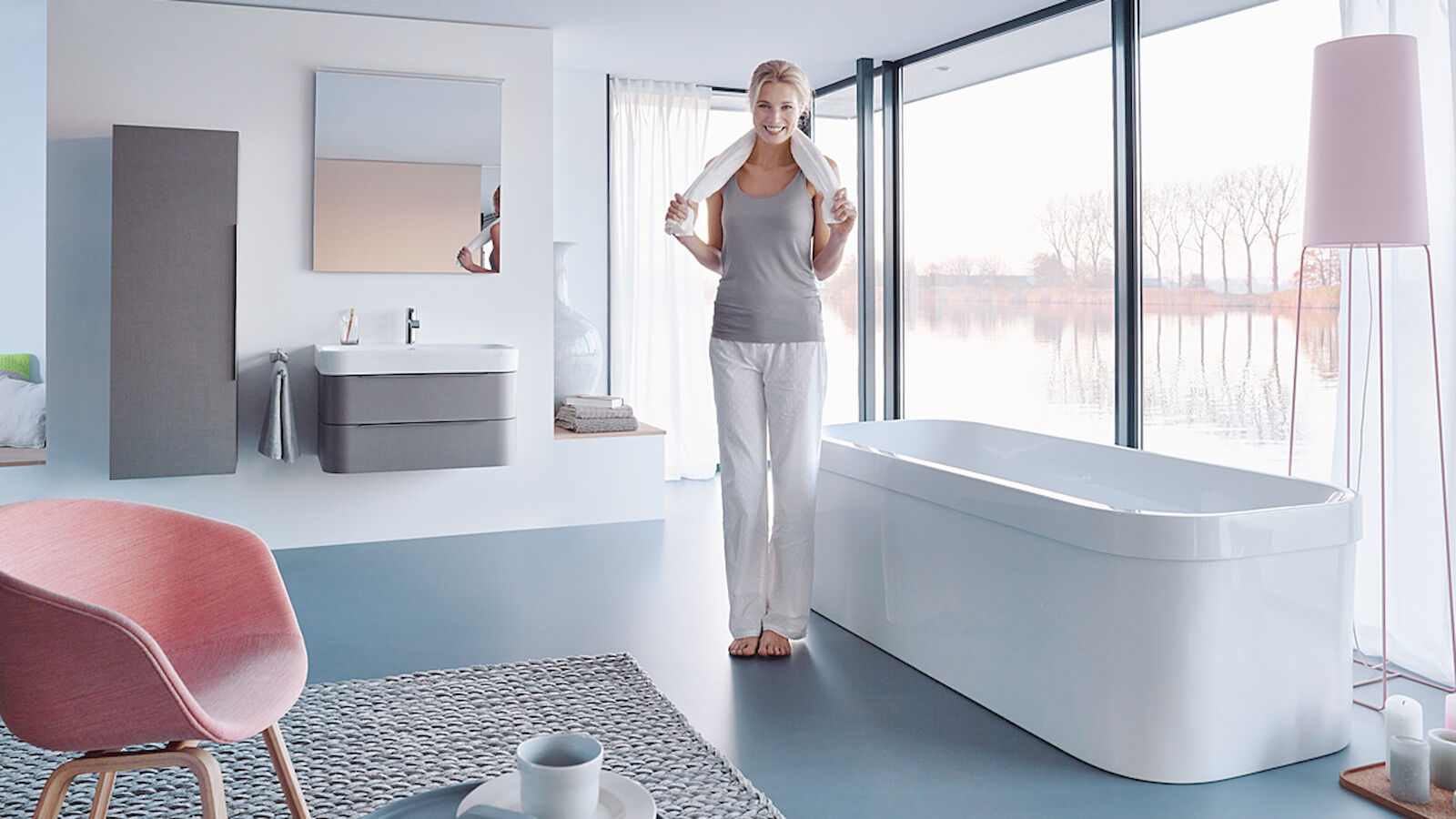
Minimalism and refinement are the two maxims behind the Happy D.2 range of furniture. This is borne out, for instance, in the coherent form of the washstand base unit: this has been pared down to two wide drawers, reflects the contours of the basin and stands out clearly from the classic sides and front of the main body. The space-saving console furniture comes with an edge height of just 12 mm. Depending on which basin is selected with which tap landing configuration, the tap can be positioned traditionally in the middle or, alternatively, to one side. Work has also been done to the surfaces: the furniture now features a new "linen" decor finish with a distinctive texture and natural feel. The range is rounded off with tall cabinets, a height-adjustable chrome console, wall shelves, and mirrors with indirect LED light.
Alongside the washstands and furniture, the series comprises 13 bath tubs with a strikingly minimalist edge. With a generous interior and ease of entry, these are designed to be functional. This goes for the back-to-wall version and the free-standing monolithic model, which – despite its slimline edge – accommodates the technology of a whirl system.
ISH innovations magazine 2013 (PDF)
- Request project information
- Share project
- Add project to favouritesRemove project from favourites
Would you like to find out more?
Get in touch with us:
Christian Sieger
Managing Director
Rebecca Wolter
Senior PR Consultant


